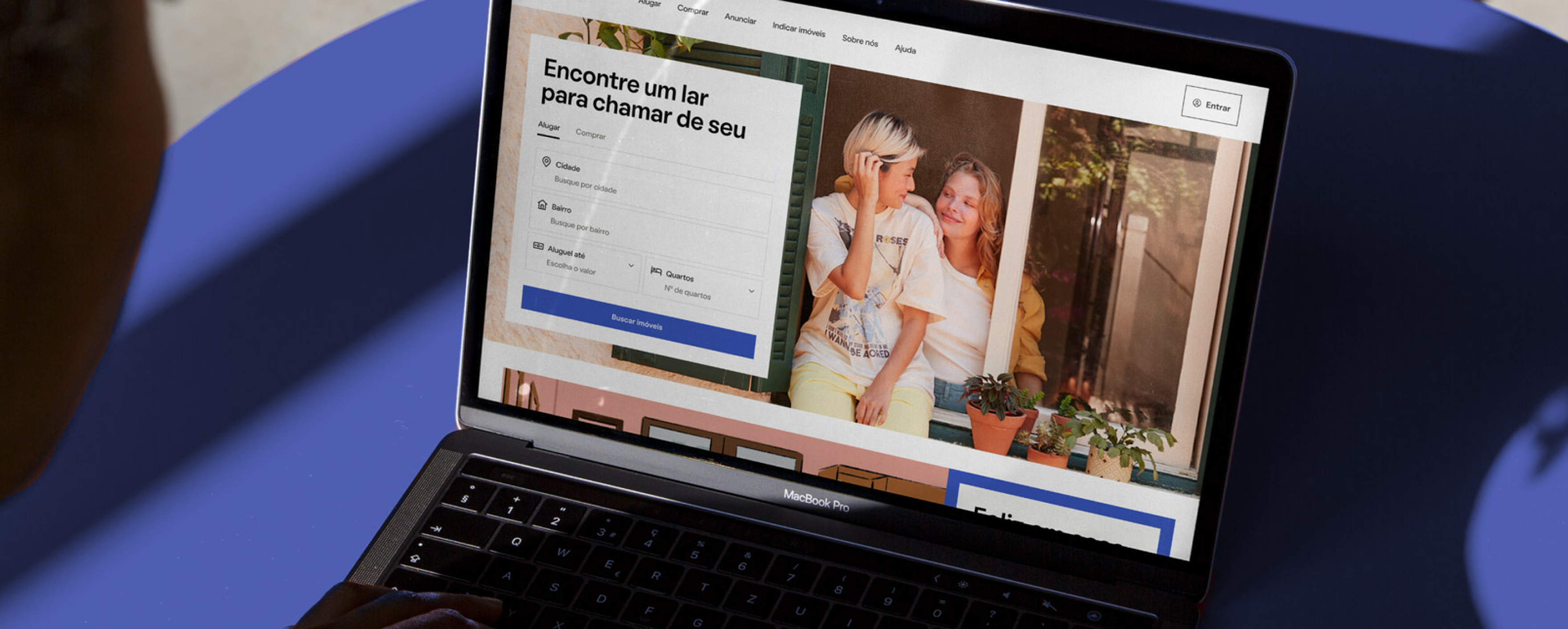
QuintoAndar is a Brazilian startup that provides a digital marketplace that connects tenants and homebuyers to landlords and sellers.
After becoming the largest housing platform in Latin America, the company partnered up with branding agency Porto Rocha to develop an entirely new identity to reflect the company's purpose around the relationships between people, their homes, and their well-being.
As a Senior Product Designer at QuintoAndar’s design systems team, I coordinated the process of systemizing that new brand into an existing, complex design system used by over 100 cross-functional teams, and roll it out in a user journey made up of +20 different applications.
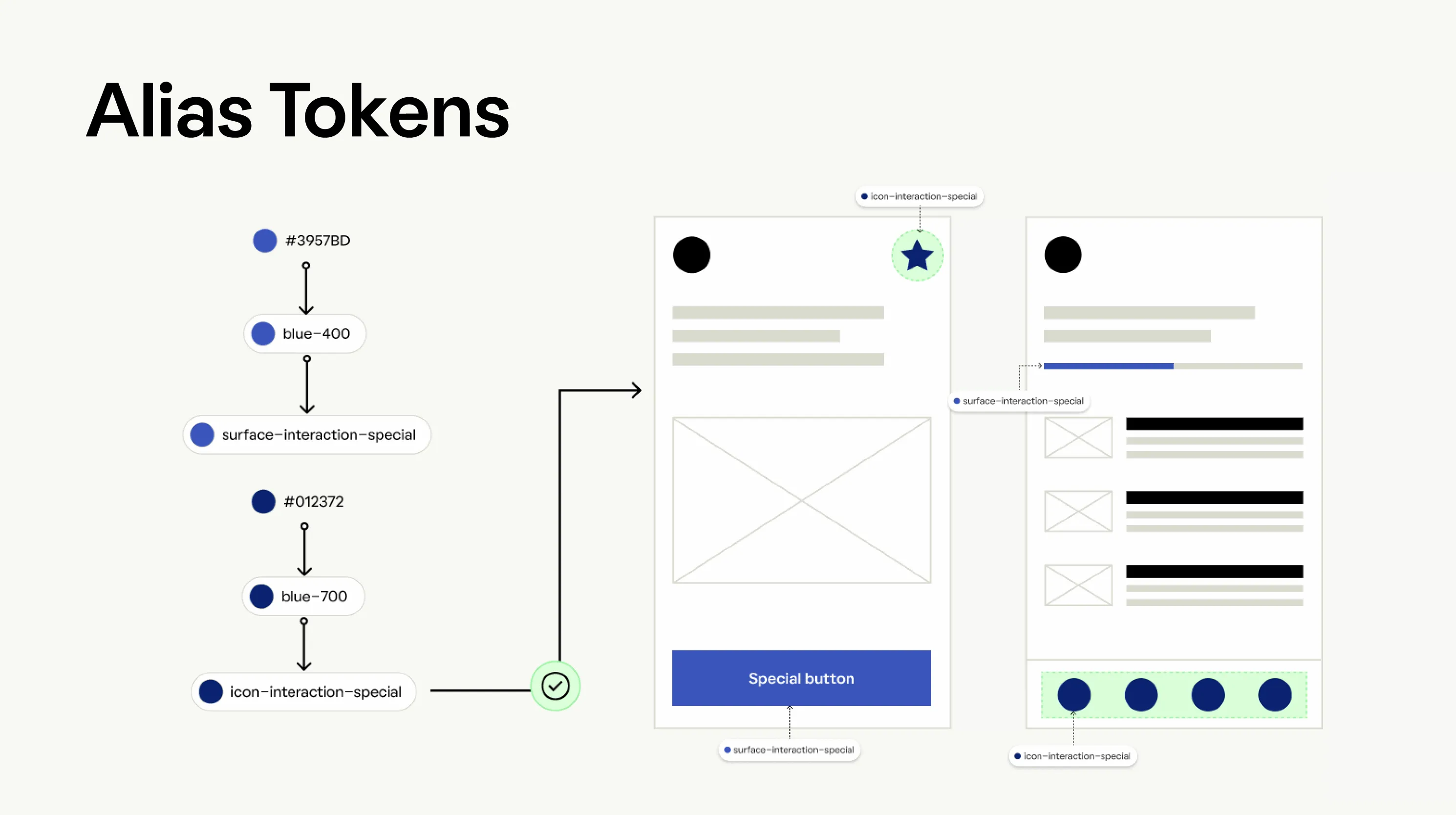
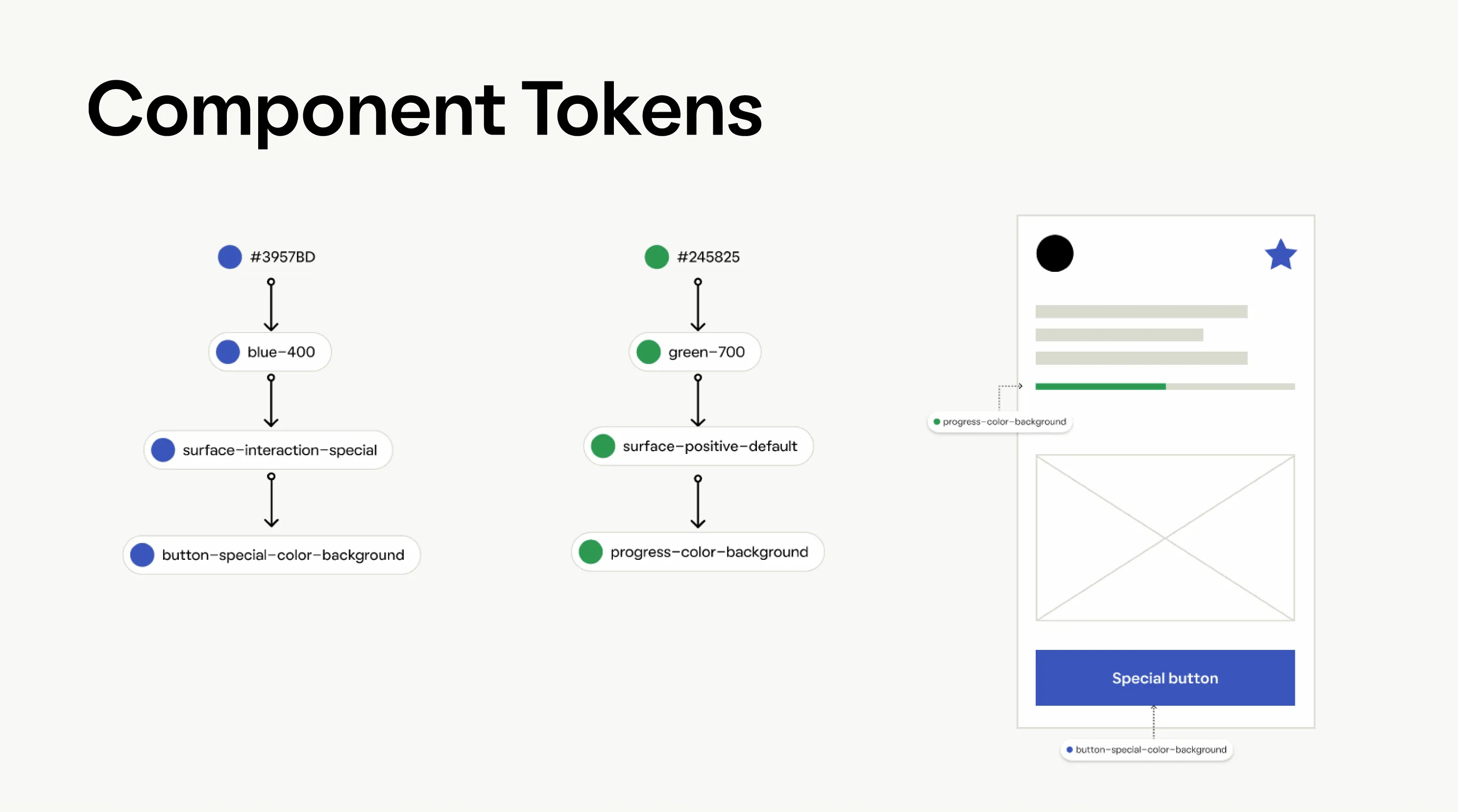
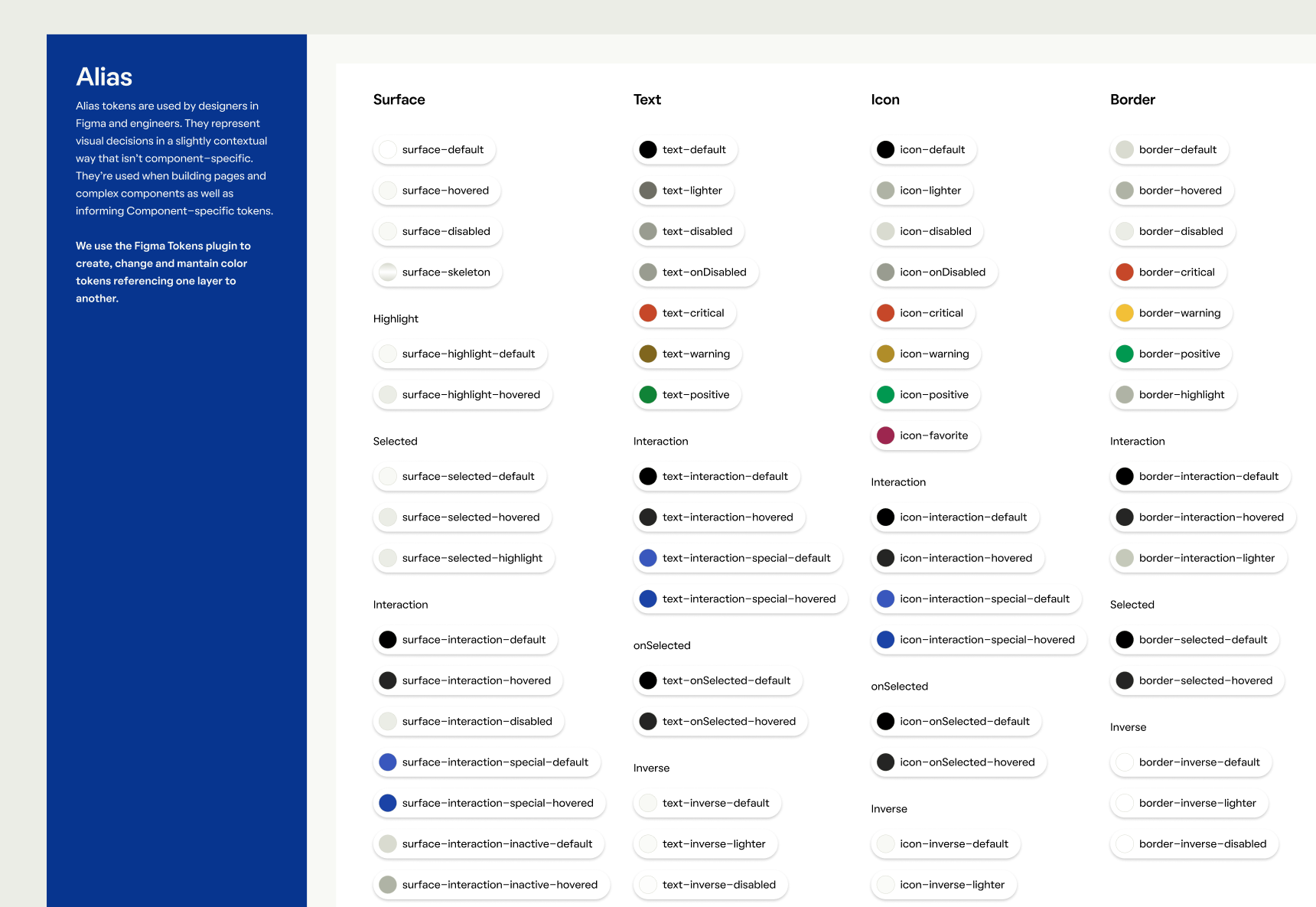
Design tokens architecture
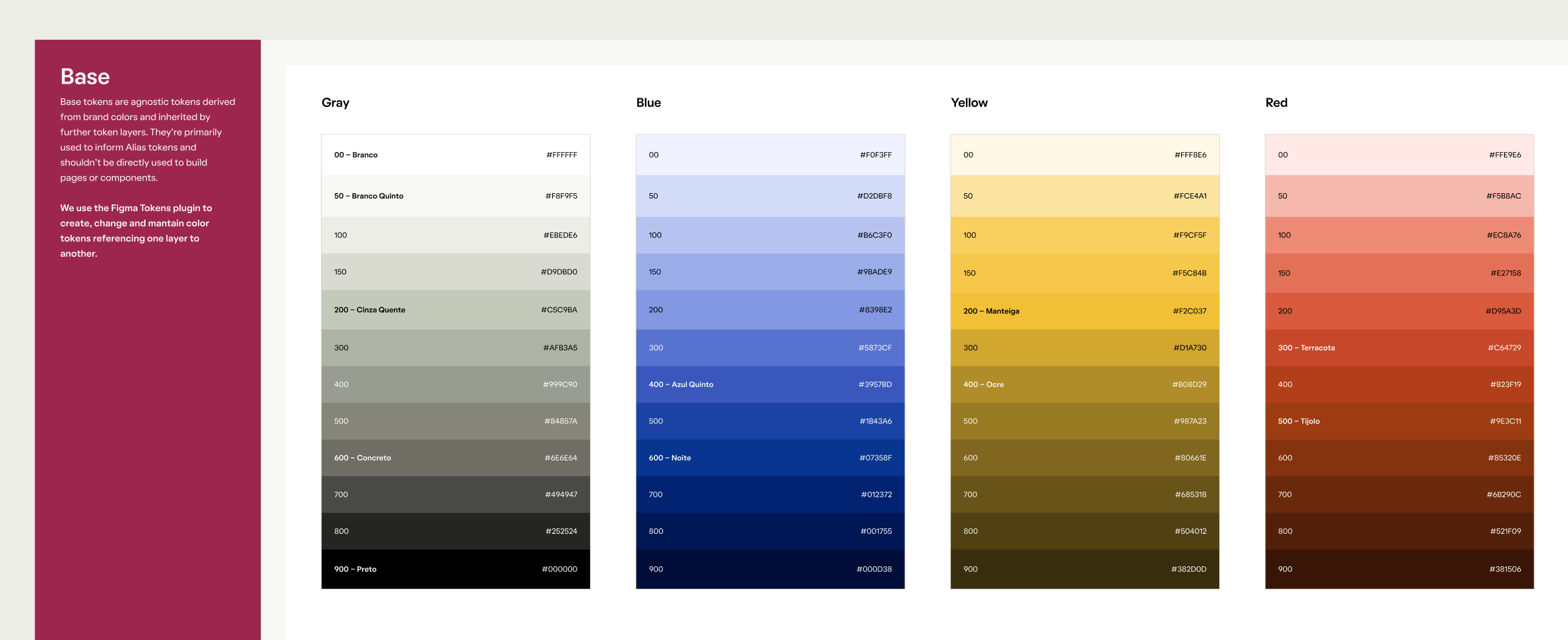
QuintoAndar’s design foundations were, until 2021, pretty much based on Material Design. Our design tokens were created around generic naming concepts like “primary” and “secondary”, which didn’t offer the level of control the design system needed.
Prior to the rebranding, we decided to completely rebuild the architecture of our design tokens with the goal of achieving a higher level of cross-platform control of our styles.
The final result was a design tokens architecture based on three tiers of tokens: base, alias, and component, that allowed for a greater level of platform-agnostic control of our user interfaces through Style Dictionary.
Product explorations
In collaboration with the Identity cross-functional team, responsible for redesigning the homepage for the release of the new brand, we started to generate concepts aiming to collaborate with the visual language. It helped us to shape a new vision as a team and allowed us to co-create and define where the new brand would start and end as a visual concept.
That’s when we defined general concepts like the hierarchy between our different interaction colors, grid structures, typography scales, and shapes roundness.
Release strategy
Our design system was used by over 700 software engineers on React and Flutter applications, and by nearly 90 product designers in Figma.
An important constraint that we had for this initiative was to keep it private, as other teams outside of our domain were not allowed to have access to anything rebranding-related up until one month prior to the release. With such a limiting constraint, it was important to define how the release could be done before getting any work done.
In Figma, I decided to create private duplicates of our libraries that only the design systems team would have access to, and eventually release them as entirely new versions of the libraries.
We made that decision considering a few trade-offs. We would have double the maintenance work since every time we changed anything in the production library, we had to also change it in the private duplicates; as well as coverage, since all the Figma files would be linked to the old library version and would require manual work to be updated.
Once it was time to release it, we created videos and guidelines instructing the product designers on how they could update their design files to the rebranded design system.
Scope and categorization
We only had a quarter to rebrand our design system, so it was crucial for us to explicitly define what we would be actually changing.
In order to support the different use cases we identified during the product explorations, I defined the following categories of changes:
- No component changes with token changes
- Component changes through token changes
- Component changes that exceed tokens
- Entirely new variations
These categories were discussed and agreed upon with the engineers and the product managers, and they were crucial to estimate the project’s effort. They were later used in all hand-off documentations.
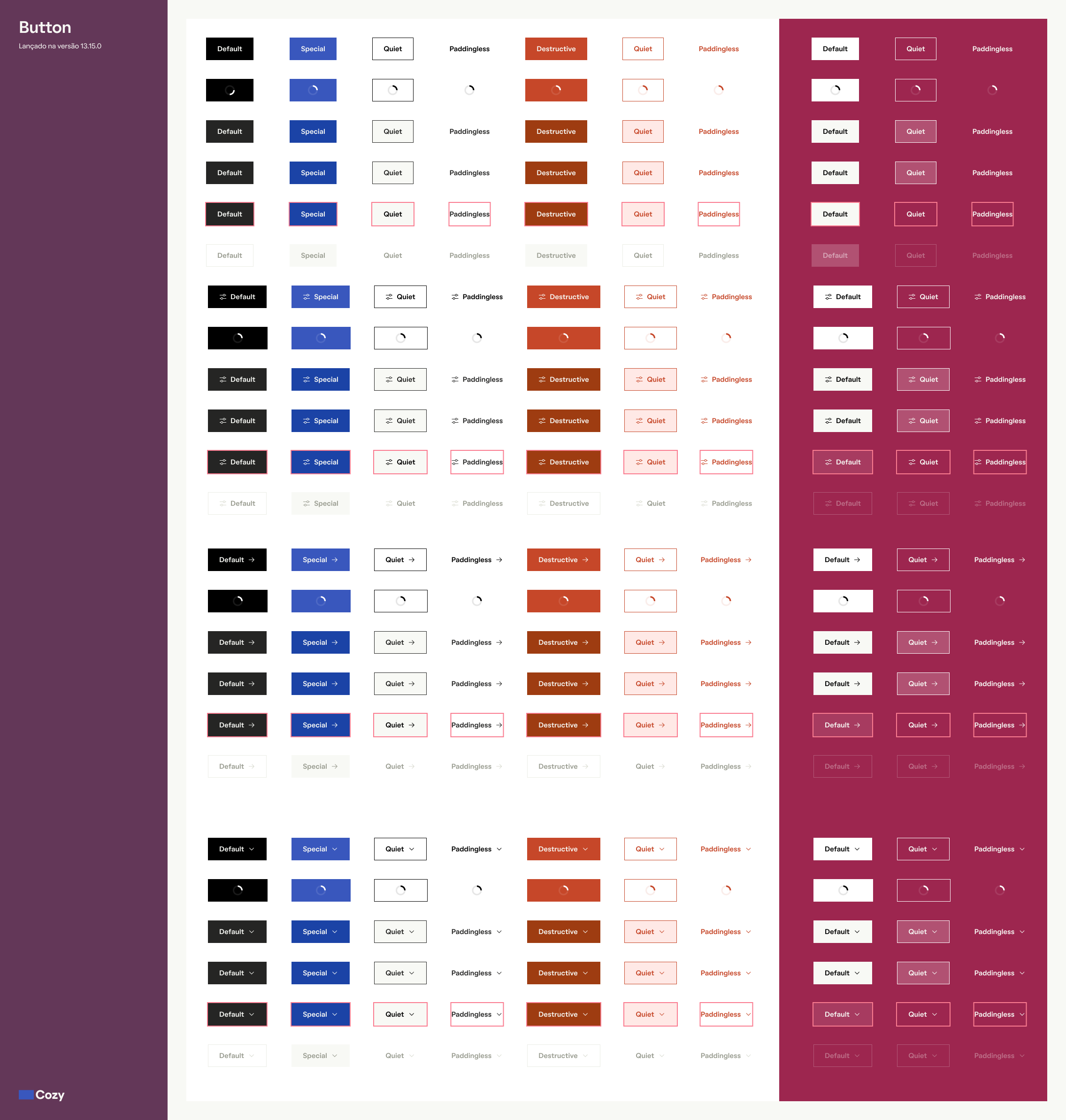
Components redesign
With nearly 50 components and 200 design tokens, redesigning every building block individually was a hard task.
The product explorations were done prior to redesigning the components for a clear reason: we wanted to rebrand the design system from real use cases, as opposed to first redesigning the system in isolation and then creating pages around the building blocks.
This allowed me to focus on the most important building blocks during the prior explorations (such as Buttons, Appbars and Fields) and later redesign the less used components by proxy, which was made easier due to we chose to architect our design tokens down to a component level.
Go live
Once the rebranding was a strategic bet for the company, every product team had one week to work on the design system update. Meanwhile, the design system's team was supporting and solving issues that were found in the update process. We also coordinated QA sessions in our main user journeys.
After this process, the product teams were responsible to solve the main issues and deliver a release and fast-forward branch with the project updated with the latest design system version.